Presentation = Speech + Slides
By Derik Badman
Back in October, Aaron Schmidt posted “HOWTO give a good presentation” to his blog walking paper. His second bullet point of “thoughts” on good presentations is:
Please don’t fill your slides with words. Find some relevant and pretty pictures to support what you’re saying. You can use the pictures to remind yourself what you’re going to say next… Your presentation should be *very* incomplete without your narration.
This is something I have been working on since I started giving presentations professionally. I sat through a lot of bad presentations in the past few years, and, while some of them were bad just because the content was poor or uninteresting, many of them were just poorly formatted. In the comments on Aaron’s post, Kevin Driedger added:
…my thoughts on slides – they should illustrate the talk, like a nice illustrated book… (Comment #10)
This lead me to a subject my thoughts often settle on: comics. In this case the equation:
Presentation = slides + speech [1]
Comics = image + text
Earlier this year I started using hand drawn images in my slides (see this pdf for an example), instead of bulleted lists or photographs, but I hadn’t yet given much thought to the factor that is common to both presentations and comics: image-text interaction. A number of definitions of comics emphasize this factor, going all the way back to Rodolphe Topffer, the father of the comics form, who, in 1837 describing one of his histoires en estampes, wrote:
This book is of a mixed nature. It is composed of a series of line drawings. Each of these drawings is accompanied by one or two lines of text. The drawings, without this text, would only have an obscure significance; the text, without the drawings, would signify nothing. [2]
This interdependence between image and text is at the core of the form of comics, and the same concept can be easily applied to presentations. Not all presentations necessarily require slides (or words for that matter), as a lecture without slides or a silent slideshow also form a presentation. In that interim place between all slides and all speech, I preliminarily posit some types of slide-speech interaction [3]:
1. Slides and speech are redundant:
This is the classic boring presentation. A slide shows a list of bulleted items while the speaker reads them off or even worse reads whole sentences and paragraphs off the slides. This redundancy of two information channels is disengaging. Most attendees will read the list for themselves more quickly than the speaker can say them. The redundancy of text and image does not provide any space for friction, thought, or curiosity. In many cases, where the speaker is not significantly elaborating on the slides’ text, the speaker becomes peripheral and even unnecessary.
Old comics are great for this sort of tedious redundancy:

from Sheena, Queen of the Jungle 11 (Spring 1951): 9.
2. Slides and speech are independent:
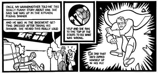
This is veering into performance, but I can imagine a presentation where the speech and the slides tell separate narratives. This is not to say that the two narratives are completely unrelated; often the point is to draw on the conflict or similarities between the two. A library conference is probably not the place to be experimenting with such things though, unless you have something really well done and interesting planned. Even comics examples of this tactic are extremely rare, the most popular example being a short story by Chris Ware called “I Guess” [4].

Panels from Chris Ware’s “I Guess”
3. Speech carries presentation:
At some point people stopped just talking and started using slides and other media. I can’t think of many examples of straight-up speeches that I’ve seen at conferences, other than some keynotes (by non-librarians) at ACRL. More common is a cursory use of slides that tend to be brief, visually dull, and do little to add anything to the speech. I used to make a lot of slides that would fall into this category, for instance:

One of my boring slides from 2006.
These slides were accompanied by lots of talking. The slides act as little more than placeholders, a visual signifier to back-up the speech and add a small portion of emphasis. This type of presentation is not necessarily bad, but it does require a speaker who is dynamic and engaging. Depending on the presentation’s content, this format may leave something to be desired in its ability to convey information in a complete manner. If I am speaking about a web application, having a number of screenshots in the slides can aid greatly in comprehension for the audience.
This type of speech and slide combination is rather popular, getting praise for Guy Kawasaki (who uses 10 slides with short words or phrases on them) or the “Takahashi Method” (using very large words). Another example of this is Lawrence Lessig’s well-regarded style. He uses a lot of slides with a small amount of text or simple images, but he displays them at a rapid rhythm. I find the visuals in the few presentations of his I’ve looked at online to be mostly superfluous, seeming to serve primarily as a visual attention grabber (give the audience something to look at) than as an additional channel of new information. Though, I shouldn’t ignore the utility of slides as attention grabber; it is a valid use.
4. Slides carry presentation:
This type of presentation is rarely seen at conferences. It belongs more to the classic vacation slideshow (“And this is the little cafe in Paris we went to on our first morning”) or, in current times, watching a slideshow from a Flickr photo set than to what someone would expect from a professional presentation. This may be the appropriate style for certain types of presentations, but one would need a good sense of design and visual narrative to pull off something like this successfully. Information that is process or space oriented might be the best candidates for visually driven slides that require little added speech.
Reader participation bonus section: Find me a good example of this in a presentation.
5. Slides and speech share duties in conveying a point:
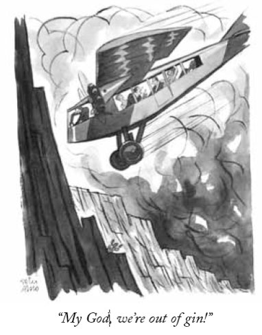
I believe this is the ideal mode for most speech + slides presentations. When visually appealing slides complement the speech, the presenter can engage multiple senses of the audience members. The conjunction of the multiple channels of words and image (sound and image) can create a synthesized effect that is greater than each individual’s. This “wow,” sit-up-and-take-notice factor is one of the joys of comics. Even in the most basic of comics, something like a New Yorker single panel, the humor and the pleasure of reading comes from the picture and the text creating something that does not exist in either one independently. A similar sense of pleasure and creation can come from the well planned slide/speech conjunction, often through contrast, metaphor, or unexpected juxtaposition.
The following comic, for instance, would not have the same effect if the text or image were viewed separately:

Peter Arno from The New Yorker 12 Apr 1930
For brevity’s sake, I must here ignore numerous other complications that arise from considering the interaction between speech, text on a slide, and image on a slide. I will also leave out much discussion of how the rhythm with which the slides are changed can effect the presentation. The simplest of slides can be effective if they are quickly moved through, while more detailed slides could retain interest for long periods of time as speech is used to elaborate on the visuals (the classic example I can think of is an art history lecture where a single work is shown and discussed at length, though even this can be improved with detail views.). As I noted above, Lawrence Lessig’s slides are often not very interesting in themselves (a word or two), but he moves through them quickly enough that the viewer’s interest can be maintained.
Many people seem to think slides need lots of text so the audience can have something to take home and re-visit or so people who didn’t make the presentation can take advantage of the presenter’s information. Slides with little or no text would be mostly opaque on subsequent viewings. I would offer a few responses to this concern. A presentation is made for the audience, the people who show up to listen. A presentation done well should not be easily boiled down to a mass of text (else, why not just write an article or a blog post). It should take advantage of its particular form/media. The best method for re-visiting the presentation or archiving for those unable to attend is a recording. Cheap options are available to make multimedia presentations available online.
When I presented in Second Life a few months ago (which I talked a bit about in my previous post to this publication), I followed up by creating a recording of my voice over the slides. In this case I re-created the presentation, recording a new version of my speech–rather than recording the original live–and then syncing it over the slides. In this way, an interested party could watch my presentation in a form closer to the actual event than a simple deck of slides.
If you want to have a take away for the audience, printing out your slides is a cop-out. There are better options. I’ve previously handed out (posted) my speaking notes as a complement to slides, allowing for viewers to at least get the main points I spoke about to accompany the slides. A simple sheet (half-sheet if you want to conserve paper) of main points and, if appropriate, urls or citations can act as a reminder and reference for attendees when they get back from the event.
Creating a presentation that utilizes an interesting combination of speech and slide does take more time and effort than a bulleted list. Besides the conceptual effort, the actual creation of the slides can become time consuming. You can create your own images (drawing, photography, etc.), but even for those without such skills, plenty of options are available to take advantage of other’s artistic work. Free photos are available through various Creative Commons sites (like Flickr’s) and there are numerous options for clip art–good clip art (check out the many options from Dover books) not that clip art that comes with MS Office [5].
The presentation of information should be important to our profession. After all, the fourth of the ACRL Information Literacy Standards includes:
3. The information literate student communicates the product or performance effectively to others.
Outcomes Include:
A. Chooses a communication medium and format that best supports the purposes of the product or performance and the intended audience
B. Uses a range of information technology applications in creating the product or performance
C. Incorporates principles of design and communication
D. Communicates clearly and with a style that supports the purposes of the intended audience
I’m not sure how directly practical all of the above is, but I hope it at least gets people thinking about the topic. Presentations can be interesting for many different reasons, and one of them is the form. I realize some of the forms above might be too “arty” for most presentations, but I don’t think it is outside the realm of reason to add more art to our conferences. Art can convey information as well (if not better) than dry technical work. Creativity should never be overlooked in our work.
Next time you are making a presentation, set aside extra time to work on your slides, not just to make them but to think about them and how they will interact with what you will say. If we challenge ourselves and our audiences, we will not only have more interesting presentations, but we will all get our brains working a little more.
Further Reading:
There are tons of books and websites about slides and presentations and the dreaded Powerpoint. There are also hundreds of books on design. You can also learn a lot from just looking at art and design and examples of great presentations. You might start with: Presentation Zen.
Thanks to Aaron Schmidt, Kim Leeder, and Ellie Collier for comments on the content and Lianne Hartman for editing.
Image Credits:
“Sheena” image is in the public domain. Drawing by Robert Webb. “I Guess” image copyright Chris Ware. Arno comic copyright The New Yorker.
Notes:
[1] I’ll admit that we could consider a speaker’s movements and body language a third factor, but that’s a whole other topic, one that is rarely put to use in librarian presentations I’ve seen. This is a channel of information that is particularly missing in the webinar format.
[2] Quoted from: Kunzle, David. History of the Comic Strip vol. 2: The Nineteenth Century. Berkeley, CA: University of California Press, 1990. 46.
[3] Borrowing a bit from Scott McCloud’s Understand Comics where he describes and names a number of image-text interactions.
[5] I’m told there is a good collection in Word from iStock Photos. It’s not on my Mac, so I haven’t seen it.

Austin Kleon reminded me of this post at his blog about powerpoint and comics:
http://www.austinkleon.com/2008/05/13/for-successful-powerpoint-presentations-look-to-cartoonists/
I wish I would have remembered that while working on my post.
Austin links to a talk with Scott McCloud about powerpoint and comics. Great quote:
When you have those text heavy slides and you are reading them aloud, the audience is five minutes ahead.
A major pet peeve of mine is the PowerPoint printout that accompanies a presentation. Wouldn’t an outline get the job done just as well, and take up less paper? Just yesterday I went to a workshop that had this, along with a huge amount of supplemental handouts. The result was a large sheaf of papers that was cumbersome and time-consuming when it came to navigation.
I HIGHLY recommend Nancy Duarte’s new book, slide:ology. Not only is it the best book on slide presentations I’ve ever read, it’s also a crash course in design, with great sections on color and composition. Check it out!
Some of us do still do speeches without PPT…unless the topic absolutely, 100% requires visuals.
But then, half of my speeches over the last decades have been keynotes, and I’m not really speaking much any more. So maybe your semi-dismissal of the non-PPT approach is appropriate.
As for PPT printouts: Can’t we at least “green” conferences enough to skip those and let people look at them on the web? Talk about waste paper…
Another quick note: Your article is so good that I’ve excerpted it (very brief excerpts) as a new section in the PALINET Leadership Network article “Presentations.”
Jenny: I have to agree. And it’s not very green either.
Austin: My library has Slide:ology on order, I look forward to reading it.
Walt: Thanks for the linking/quotation.
What a fresh way to look at slide presentations! I have read so much lately about how to improve your presentations, but felt that much of it has been said before. Tying in comic books to illustrate your argument is brilliant and makes the information stick so much better. I’m looking forward to using these ideas in my next ppt.
Thanks
As far as an example of #4 goes, this may be cheating, but what about David Heinemeier Hansson’s first Ruby on Rails video? It’s still available at http://www.rubyonrails.com/screencasts — just look for the screencast for Ruby on Rails 0.5.
In my mind, this presentation, ca. 2004 or 2005, was probably the landmark moment for Ruby, Rails, and screencasting. It’s funny, though: watching it now is a bit like watching the original Star Wars. I remembered an audio track in the Rails video, but I guess I was wrong, because there isn’t one. It’s just DHH installing Rails and creating an app.
Back to your point: this presentation is process-oriented, as you noted in discussing “Slides Carry Presentation,” and it’s also not a deck of slides, it’s a screencast. But it’s also a nice reminder that sometimes the best thing a presenter can do is eliminate commentary and let a process or space speak for itself.
I loved this post. It provided an interesting take on art of the slide presentation. I’ve been away from librarianship for 3 years and recently returned.
I have been surprised by the number of folks who post their presentations online. This practice would be informative except that frequently there is no accompanying notes or audio. Slides with one or two words or just a picture are great live while you are there to hear the speaker. But, later, as an online resource, they are basically useless. It has become a frustrating result when searching for current thought on library issues.
I encourage folks to add notes or audio to make them truly useful for folks who did not attend their original presentation.
Nice job on your post Derik – a good way to think about different approaches to presenting. You may want to watch a video of a Seth Godin presentation. Based on your categorizations it may be his is of the Lessig type. But it’s a rapid fire series of slides – mostly all images that are timed to fit near precisely with his text – so you are constantly subjected to new images – a number of which are pretty amusing – and his discussion of the topics. The images don’t always match the text but most will. It’s clearly a well choreographed presentation – beyond the time most librarians can put into presentation preparation. But he really engages the audience. What about video in presentations? I have been trying it. It gives me a short break to regroup and it can set up a discussion within the presentation. Most presentations exclude the attendees. What style might be best to engage them in the presentation as participants?
Thanks, Steven. I found this recent presentation by Godin, and based on that one, he is using his speech and slides in an complimentary way more so than what I’ve seen of Lessig’s presentation. He’s not changing too rapidly in that example, but he is often using images that are relevant to his speech but not in a direct word for word correlation.
I really don’t have an opinion about videos in presentations. Haven’t seen it happen very often. A lot would depend on how much the video is appropriate. Is it just filling time or is it really adding something.
I think the more the slide-speech interaction is getting the audience to make connections and to think, the more they are engaged. But that’s not in isolation of just plain old interesting and engaging topics (which, if lacking, makes all of these styles pointless).
I like the concept of having the handout be its own take-home thing separate from what/how you may be presenting. This seems so obvious and yet is a big “duh” to me.
I also liked that you said “The presentation of information should be important to our profession.” I think it actually would behoove information professionals to take acting lessons and communications classes. I’m just saying.
Thanks for this Derik. The majority of my presentations end up going live to the software I’m talking about, or using screen shots if I’ve planned that far ahead. This does make for very little to give to people as take-aways or for them to see when I post my presentation later. Recording the audio track will go on my future to do lists.
Hi Derik. Nice article. Thank you.
Just FYI, I have created a very video-heavy presentation. I was talking to a mob of art librarians about Second Life, and wanted to keep the presentation tight. I made separate machinima and interspersed it throughout my talk… 1) A flying tour of Info Island. 2) A tour through an Art Garllery on Info Island Two and then a tour through the Museum of Music to show how good interactive design can be used in Second Life exhibits 3) An avatar walking through and interacting with an art installation funded with a $20K Australia Council grant. … I spoke over these bits, so neither the talking or visual part of the presentation would have worked in isolation.
I also included lots and lots of screenshots that I used to illustrate my points as I talked.
The night before most of my presentations, I open up Audacity, slip on a headset and record my talk exactly as I intend to do it. I can then quickly make a slidecast if I have time. I think of that as my handout. It also means that if someone asks me months and months later to give the same or similar talk, I understand what all the slides mean … I never write a text outline of what I am going to say…
I loved this post, thanks a lot. Some of the best presentations I’ve been to assume that the audience is smart, and can make a few leaps between what’s on the screen and what the speaker is saying.
From the exception-that-proves-the-rule department, when you are giving a presentation at an international conference (and I recommend this highly), many people in the audience may not be native speakers of the conference lingua franca and it is a good idea to summarize your talk in bullet points on slides so that everyone can follow what you are saying.
Good communication is full of nuance, and it sucks to not understand what someone is saying just because they think bullet points in PowerPoint are evil.
And um yeah, I was the guy who did it wrong.
Caleb: In a multilingual situation, I might, instead of putting summaries on the slides, make sure handouts are available of notes/summaries for people to follow along, that way I could still use interesting slides without negatively affecting some of the audiences comprehension.