Inclusivity, Gestalt Principles, and Plain Language in Document Design
In Brief: Good design makes documents easier to use, helps documents stand out from other pieces of information, and lends credibility to document creators. Librarians across library types and departments provide instruction and training materials to co-workers and library users. For these materials to be readable and accessible, they must follow guidelines for usable document design.
Improving document usability requires a basic understanding of accessibility and Universal Design for Learning, plus a few simple tips found in Gestalt and plain language principles. Using Gestalt principles helps connect concepts within the document in a coherent way. Plain language principles emphasize clarity in writing. This includes evaluating linguistic complexity and readers’ comprehension of the text. Keeping the needs of people with visual, motor, and cognitive impairments in mind when creating a document can also improve readability for all users.
The authors will demonstrate how adhering to these principles will improve accessibility and functionality of library documentation for everyone who uses them. They will also direct readers to resources to help librarians create usable documentation for library processes and procedures.
by Jennifer Turner and Jessica Schomberg
Introduction
Documents, in the sense we use them here, include external resources such as teaching handouts and library websites as well as internal documents like training guides and policies. As a profession, we should be mindful of the impact of intentionally incorporating usability and accessibility in our practices. Librarians can adopt a document design approach that proactively considers accessibility needs when creating documentation, rather than performing retroactive modifications upon request by a user. (Kumbier and Starkey, 2016; Guest Pryal, 2016) After reading this article, librarians will have tools to make sustainable improvements to their document design processes.
Document Accessibility
Accessibility is not accommodation. Accessibility is the deliberate provision of access through a thoughtful awareness of the multiple ways in which our users might need to interact with our resources. Accommodation puts the burden on our users. Accommodation requires people to request mediation from “a gatekeeper, to ask for something extra, and often to prove that she deserves accommodation in the first place” (Guest Pryal, 2016). When we design resources without considering different abilities or resources that are inaccessible to whole segments of our population, we exclude some of our users from full participation in library services (Williams, 2012; Copeland, 2011).
The Report of the Association of Research Libraries Joint Task Force on Services to Patrons with Print Disabilities states that “Research libraries have a responsibility to make library collections and services universally accessible to patrons” (ARL 2012, p. 4). As defined in this report, print disabilities are inclusive of visual, physical, perceptual, developmental, cognitive, or learning impairments that hinder people’s ability to process textual information. Text-based library services include discovery tools, subject guides, electronic resources and documentation about how to use these services. If we as a profession do not design our resources to be inclusive of as many people as possible, we may be creating barriers to learning instead of offering pathways.
It’s not just patrons who need to use library documentation. Library employees also need to be considered. While specific accommodations are negotiated with local human resources offices in compliance with the Americans with Disabilities Act (ADA), this again puts the burden on the person with disabilities to self-disclose and to go through the bureaucratic accommodations process. Imagine how much easier things would be on everyone if we designed documents with inclusivity in mind.
Ethics
The ADA states that “[p]ublic entities are not required to take actions that would result in undue financial and administrative burdens” nor make modifications that “fundamentally alter the nature of the service, program, or activity being provided.” (DOJ, 2009) However, we advocate approaching our work as though these exceptions do not exist. Making utilitarian or rule-based ethical evaluations of accessibility are unnecessarily limiting. While a number of library patrons’ and employees’ disabilities are visible, any number of our users might experience hidden or undiagnosed disabilities. Also, due to stereotypes of people with disabilities, individuals may be hesitant to declare an accessibility need. (Brune and Wilson, 2013)
As we cannot assume to know everyone’s specific situation, we should aim beyond meeting the letter of the law. We should proactively create tools and resources to benefit the widest community of users possible. This includes both internal and external documentation.
Universal Design for Learning
Universal Design for Learning (UDL) is a curriculum development method that strives to proactively provide inclusive opportunities for the widest range of learners possible through multiple avenues of representation, expression, and engagement.
Practitioners of UDL are advised to ask two questions about design choices as they create instructional materials:
- How does the design choice help learners meet the goals of the learning situation?
- How does the design account for learner variability? (CAST, 2014).
UDL co-exists with accessibility. Neither practice requires us to develop more content. Instead, they ask us to be intentional about the content we produce and seek to identify the multiple ways content users might approach the materials.
Throughout this article, we will make a case for asking these questions during the document design process to ensure design choices are purposeful and accessible. As Edyburn states, “[t]o meet the needs of some, UDL is committed to giving the tools to everyone” (2010, 39).
Gestalt theory and documentation
In this section, we will present design recommendations that come out of Gestalt theory. These principles help us understand how people make sense of visual information, which can guide our display decisions. In keeping with the principles of accessibility and UDL, visual displays of information should make a document easier to understand. Follow UDL’s overarching theme of providing options to learners (CAST, 2014) by providing alternative ways to accesses information. Make these alternatives available to all potential users, not just those who request accommodations.
Principles of Gestalt and Relation to Design
Gestalt theory was developed in the early twentieth century by German psychologists Max Wertheimer, Wolfgang Kohler, and Kurt Koffka. As opposed to the structuralist concept of breaking wholes into component parts, a Gestalt is a complete structure whose parts must be understood in relation to each other. A basic understanding of each Gestalt component in relation to document design will aid document creators in identifying and developing effective documentation. We will also reference related W3C guidelines, as they are becoming the emerging legal standard for disability access in web design.
Figure 1. Visual Gestalt
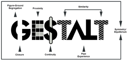
This work, “Visual Gestalt,” is a derivative of “7 Laws of Gestalt” by Valessio used under CC BY 4.0, via Wikimedia Commons. “Visual Gestalt” is licensed under CC BY 4.0 by Jennifer Turner.
Figure-Ground Segregation
Figure-Ground Segregation advises that type and essential design elements be distinctly separated from the background image or coloring. This aspect of Gestalt theory is supported by Web Content Accessibility Guidelines principle 1.4, which instructs designers in how to make content distinguishable (W3C 2008). In the “Visual Gestalt” image, we can read the word “Gestalt” with relative ease. In part, this is because it is black text on white background. Use contrast to ensure readers can clearly identify and read the information.
In figure 2, the text in the first box is difficult to read, because it is dark text on a dark background. The second box is slightly better, because a light gradient has been applied to the background. However, it still lacks the contrast that would make it easier to read. The third box demonstrates improved figure-ground segregation. The black text is clearly segregated from the white background. Note that while most people are aided by strong black-white contrast, some people with dyslexia prefer lower color contrast such as black-crème (Rello and Baeza-Yates, 2012).
Figure 2. Figure Ground Segregation
Closure
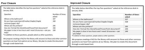
Closure identifies our need to fill in gaps to create complete concepts and images. In the design world, closure advises us to clearly identify and separate different parts of a text. WCAG guideline 1.3.2, which describes creating meaningful sequences, is related to this concept (W3C 2008). We can tell the first letter in figure 1 is a “G,” because our minds fill in the gaps created by the white line through the letter. Unclear closure can make reading documents complicated. In documents lacking closure, images or insets may blend into the surrounding text. This is especially true if these insets are text-heavy.
In figure 3, the table may be difficult for some users to differentiate from the surrounding text. Adding a standard table template from Microsoft Word allows readers to more easily see this information as an inset. The use of shading and lines between table rows also aids readers in following lines of information across gaps. Readers can more easily identify that 337 people asked about the bathroom, while 328 people asked for office supplies.
Figure 3. Closure
Proximity
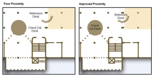
Proximity provides information about how to group content. In figure 1, we know the little boxes form the letter “E” because they are close to each other. When information is clearly grouped, we can easily identify conceptual relationships between document parts.
In figure 4, it is difficult to attach the labels for the reference and check out desks to the appropriate map feature. Placing the text in closer proximity to the associated object makes it more clear that the check out desk is the circular structure and the reference desk is the curved structure to its right.
Figure 4. Proximity
Continuity
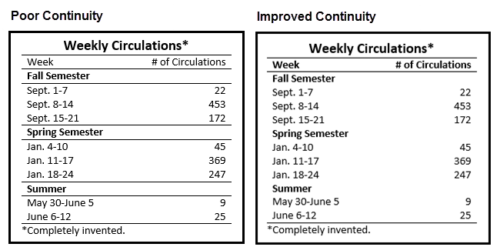
Continuity occurs because our brains continue shapes and forms past their actual stopping points. Although not a perfect example of continuity, the “S” in figure 1 is recognizable because we naturally assume the curves of this letter continue behind the rod running through it. Continuity is especially important when designing informative tables. We need to continue lines of information and make sure information at the bottom of a table is clearly associated with information at the top of the table, especially when page breaks are involved.
In figure 5, continuity is interrupted in the first table through the use of lines between information for different semesters. Removing these lines, as demonstrated in the second table, makes it more clear that the information in the last rows of the table still refers to weekly circulation totals. If this example were longer and divided between pages, it would also be important to repeat the column headers and, possibly, the table title across the top of the table on each page to encourage understanding through continuity.
Figure 5. Continuity
Similarity
The principle of similarity reminds us our minds group things that resemble each other. Although separated by two letters, the letters “T” in figure 1 are similar in shape and texture. As a result, our minds cannot help but see them as related. This element of Gestalt reminds us to use font changes deliberately.
In figure 6, the first box demonstrates how fonts and colors encourage us to seek connections that may not really exist or neglect to connect related information. For example, our minds want to see a relationship between the words “click” and “chat, email, or phone.” However, these pieces of information are unrelated. Conversely, “Class and Subject Guides” and “Ask a Librarian” are both links on a page, but this is not clear, because different fonts and colors are used for each link. The second box removes the confusing relationship, while clarifying the desired relationship between the links.
Figure 6. Similarity
Past Experience
Past experience saves us time by allowing us to interpret designs based on preexisting knowledge. The “AL” in the “Visual Gestalt” image might be difficult for newer readers of Latin script. However, past experiences allow experienced readers to interpret the connected angular images as an “A” and an “L.” On the other hand, experienced readers of English who have dyslexia may still struggle with this particular example because of the unfamiliar font style in the image. (Rello and Baeza-Yates, 2013)
Past experience can also help users navigate cultural aspects of document design. For example, documentation about finding books may tell library users to write down an item’s call number. However, users may have difficulty identifying a call number in the catalog, if this information is not clearly labeled. For new academic library users in the United States searching for Between the World and Me by Ta-Nehisi Coates, E185.615 .C6335 2015 might not look like a call number for the book. Instead, past experiences in public or school libraries might tell them to look for something like 305.8009 Coates to find this item on the shelf. UDL advises us to “provide options for comprehension” by “activating or supplying background knowledge” (CAST, 2014). When possible, refer to prior knowledge, but also enable those without this knowledge to gain it.
Symmetry/Equilibrium
Although not always included in articles discussing Gestalt theory, symmetry or equilibrium allow readers to clearly identify starting and ending points for a document.
Figure 1 was created for an English-speaking audience. While experience tells us to begin reading from the left, visual clues of symmetry tell us the entire image is contained in the outline. We know that this image is not a direct part of the surrounding text. Symmetry and equilibrium also allow readers to feel at ease while consuming a document. When symmetry and equilibrium are used in keeping with UDL’s advice to enable users to monitor their progress (CAST, 2014), readers do not need to struggle to figure out if there is more information hidden somewhere or if they started reading the document in the correct place.
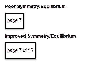
In figure 7, poor symmetry is demonstrated through the use of a page number without surrounding contextual information. Think of an online survey without a progress bar. The second image demonstrates improved symmetry by placing the page number in context. Instead of simply knowing they are on page seven, they now know they are about halfway through the document.
Figure 7. Symmetry/Equilibrium
For additional information about and examples of each of these Gestalt elements as applied to design, see Moore and Fitz (1993).
Appropriate image and design use
Even a well-designed image must be used carefully. It can be tempting to include images throughout your documentation. Technology allows us to create images, change fonts, add color, or otherwise modify our work quite easily. However, we need to clearly identify the purpose of any image or design choice. If the image adds meaning the text alone cannot convey, include it. If it does not add meaning to the surrounding content, carefully consider it. Question whether it distracts users from important content or if it might be confusing to readers.
In addition to making sure images and designs are purposeful, it is essential to make sure users with visual impairments can understand the concepts without visually seeing the image or design. Use alt-tags to describe visual images. It is important to make sure these tags are adequately descriptive. Ensure document text is comprehensible when read in plain text format. Keep in mind that screen readers and other reading aids may not navigate a website or document in the same way a sighted individual navigates the content.
This isn’t to say you should stay away from images or special formatting for fear of excluding a segment of the document’s users. While people with visual impairments may find images to be less useful than text, people with cognitive impairments like dyslexia may be helped by supporting images, diagrams, and visual representations that clarify written material (Currier, 2015). As with all design choices, be mindful of the varied ways users will consume a document and look to create a flexible, usable document for these variations.
Plain language and documentation
This section will present recommendations about language use. These principles help us understand how people make sense of textual information, which can guide our writing decisions. The primary principle of plain language is to use language that is clear to readers.
Words
“Logic (in the popular, rather than the logician’s sense of the word) which is the basis of rhetoric, is evolved out of a culture; it is not universal.” (Kaplan, 1966, p. 2) English speakers expect information to be presented in a linear way, with topic statements and topic subdivisions representing either inductive or deductive logical ordering. Many of the following guidelines are based on Western rhetorical preferences, adapted to library contexts from information provided on plainlanguage.gov and in the US Securities and Exchange Commission’s [PDF] A Plain English Handbook.
Context
In keeping with the Gestalt principle of past experience and UDL’s guidance to supply background knowledge, present context before going into details. If you need to use library jargon or an acronym, explain what it means each time it’s used. This is especially important for external documentation and documentation intended for new employees. However, don’t assume that all members of your staff are capable of the cognitive load required to have all library jargon utterly memorized at all times.
For example, when drafting instructions for using the tagging feature in LibGuides, provide information about what these tags do and when they should be added to a library guide. Although this information is not essential to performing the desired task, it will help new or less familiar guide creators in processing and applying the information.
Headers
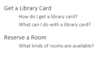
Use descriptive headers and sub-headers. This is consistent with WCAG guideline 2.4, which describes how to make content navigable. Use questions instead of noun phrases. Be consistent with heading levels. These actions lower a reader’s cognitive load and enable them to more easily navigate a document. Additionally, using official headers will assist screen reader users in navigating the document, by allowing them to skip from header to header, rather than reading through an entire document to find relevant sections.
Sentences
Use short sentences and active voice. Use subject-verb-object order. Avoid embedded clauses and parenthetical statements. Use positive phrasing instead of using “not.” If you can use both visual and textual cues, do so. Generally speaking, don’t post images of text. If you must do so, remember to use alternative text on the images so they are readable by a screen reader.
Compare
- Library cards can be used to check out books. (passive)
- You can use a library card to check out books. (active)
Compare
- Children must be accompanied by adults. (object-verb-subject, also passive)
- Adults must accompany children. (subject-verb-object, also active)
Compare
- These are the resources you cannot use. (negative)
- These are the resources you can use. (positive)
Compare
- If you find a damp or wet book in the Library collection, and it’s during regular business hours, please bring it to the Preservation Department immediately; if it is on the weekend or in the evening, place the book in the freezer, and contact the Preservation Department. (complex sentence with embedded clause)
- If you find a damp or wet book in the Library collection, contact the Preservation Department. If no one is available to help, leave a message. Then, place the book in the freezer. (shorter sentences with no embedded clauses)
Words
Use everyday words. Documentation does not need to be written in highly academic, obfuscatory language. Documentation needs to be written using words that are understood by your audience. If your audience is multilingual, try to find the resources to offer documentation in multiple languages. However, don’t just copy and paste text into Google Translate and call it good. Even if you use your clearly written English version as the basis of a non-English draft, you need to hire an expert speaker to edit and proofread it for you (Wallwork, 2014).
Using a succinct, clear, and active voice directly supports UDL’s guidance to use clear vocabularies and structures (CAST, 2014). This practice also supports access for multilingual learners, who may have more limited vocabularies in their non-native tongues.
Typeface
You may want to choose a different font type for headings versus the body of a document to help your reader quickly understand the content organization. In keeping with the Gestalt principle of similarity, be consistent in your font choice within those categories. To make documents more readable for people with dyslexia, researchers recommend using common fonts that people are used to seeing. Rello and Baeza-Yates (2013) studied the readability of different fonts for people with dyslexia. They found that sans serif, monospaced, and roman font styles were much more readable than serif, proportional, and italic font styles. They recommend using Helvetica, Courier, Arial, Verdana, or Computer Modern Unicode.
Spacing
When making spacing decisions, keep in mind the Gestalt theories of closure, proximity, past experience, and symmetry/equilibrium. For Western audiences, left-justified text is easier to read than centered or fully-justified text because the spacing is more consistent. Inconsistent spacing is often unnecessary information that adds to the cognitive load. Additionally, spacing should be used to clearly group pieces of information together. Although white space adds length to a document, don’t be afraid of using it to help clarify concepts and simplify the reader’s journey through the material.
Assuring usable, accessible documentation
“Great text + weak design and weak text + great design will both have the same effect: a document that doesn’t achieve its goals” (Bush and Zuidema, 2011, p. 87).
One of the primary recommendations from Copeland’s study of the needs of library users with disabilities is a reminder that ADA compliance “does not always ensure usability” (2011, p. 236). Actively seek the voices and input of your community, including those with disabilities.
Usability testing
Usability testing does not need to be an arduous process. If you’ve followed accessibility recommendations, you are already well on your way to creating a usable document. Even informal usability tests can help maximize a document’s effectiveness.
Depending on your needs, there are a variety of user tests you can conduct. Make sure your study group has diverse members of your user population, including people with disabilities. Try to build time into your design process to do multiple iterations, so you can modify your documentation and test it again.
If your testing is based on prior knowledge, you could conduct interviews, focus groups, card sorts, participatory envisioning, story boarding, or surveys with users to ask what parts of existing documentation they found easy or hard to understand.
If your testing is not based on prior knowledge, you could have users try to use your documentation. Ask them whether they were able to successfully complete their task. Ask them if they have ideas about how to make the documentation better. Conduct paraphrase testing, where you ask users to explain what the documentation said in their own words. This is helpful for finding comprehension problems.
Before, during, and after usability testing, there are several additional actions we can take to ensure usable, accessible documentation. Usability testing should assist document creators in working through each of these factors and help clarify which document choices are most appropriate for a given document situation. For more inclusive usability testing ideas, see Langdon et al., 2014.
Editing
In addition to testing, careful editing helps streamline documentation to the essential pieces, making the document more usable. When editing for content, ask questions like:
- What is missing?
- What is unneeded?
- Does this make sense to me? Will it make sense to other people?
- Can people navigate the document easily to find relevant documentation and use it to accomplish specific goals?
- Is jargon explained?
It’s not always easy to edit your own work. Usability testing or an outside editor is great for this. Text-to-speech functions can help identify confusing pieces of information or awkward phrases. This software is standard on many modern computers.
Checking Accessibility
Just as technology assists people with diverse needs, it can also help identify accessibility issues in your documentation. Some tools are freely available online or come standard in frequently used software.
Microsoft Word Accessibility Checker
Many recent versions of Microsoft Office include an accessibility checker. Document creators can use this tool to identify potential issues that may make it difficult or impossible for some people to consume a document, along with tips for fixing the issues.
Unfortunately, accessibility checkers are not universally available in all word processing platforms. This functionality is not yet available on Microsoft Office for Mac. However, there is some movement among software developers to enable software users to create accessible documentation. While not a default feature of LibreOffice, it offers an extension allowing users of this software to check their documents for accessibility. Google Docs also lacks an accessibility checker, but offers a checklist writers can use to develop more usable documents.
Online Color Blindness Simulators
Color blindness can be difficult to describe and understand. Thankfully, online color blindness simulators exist to assist in making documents accessible to these users. Some allow you to upload your own images to check for accessibility for different types of color blindness. Others run entire websites through simulators to give an idea of how color choices may impact users’ interaction with content.
Figure 9. Color Blindness Simulation

Image simulation source: Coblis—Color Blindness Simulator
Other Resources
In addition to using freely available accessibility checkers and simulators, software may be available through an associated office in your school, university or corporate campus. If none of these options is sufficient, libraries should consider purchasing access to accessibility tools such as JAWS Screen Reader or OpenBook. These tools will help you learn how your patrons interact with your documentation. Patrons will also benefit from access to both the tools and library staff with knowledge of tool functionality. If a library cannot afford a large investment in accessibility aids, some may be accessed on a trial basis or at a lower cost for a temporary period. This may be of use when updating, testing, or creating large quantities of materials.
Beyond using tools to help ensure accessibility, the Web Content Accessibility Guidelines provide information about making web content more accessible to people with visual impairments, hearing disabilities, cognitive and mobility limitations, and photosensitivity. These guidelines cover topics including contrast ratios for readability of text and providing text alternatives for image and audio content so it can be changed into usable formats (W3C, 2008). For assistance creating accessible documentation beyond the web, many colleges, universities, and other educational organizations often provide guidance for meeting the needs of diverse learners in the classroom. This includes how to create accessible handouts and other materials.
Turner’s Five Laws of Document Design
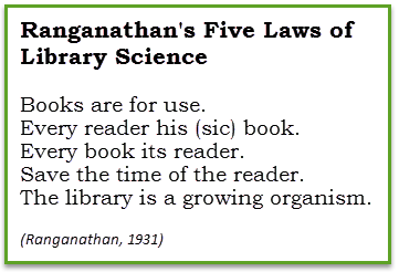
Ranganathan’s Five Laws of Library Science have provided a foundation for library work since their original publication in 1931. These simple guidelines allow librarians to assess library practices and make decisions.
We propose a second set of five laws, Turner’s Five Laws of Document Design, to help guide librarians in developing usable and accessible documentation.
- Design is for use. Consider your users. What will make the document more useable for them? Fonts, screenshots, and colors should be considered with the intended user or users in mind.
- Every document its design. What format is best for the task at hand? Task-oriented activities might be well-suited for a list format, while complicated concepts might require lengthier explanations. Additionally, consider multimodal documentation. Videos may help document users understand the text and vice versa.
- Every design its purpose. Just because a design or format choice is possible, doesn’t mean it is the correct choice for a given document. A fancy font or video should be employed to achieve specific means. Return to the first law of document design and consider the needs of potential users over your own needs. Colored paper may make it easier for you to organize handouts, but document users with vision impairments may benefit from high contrast black-on-white printing.
- Save the time of the user. What are the document’s end users looking for in the material? How will they use it? Do they want or need to consume the entire document or would it be better to divide the content into smaller pieces for point-of-need reference?
- Documents are changeable organisms. Documents should be continuously updated to reflect feedback from users, changes in conditions, and new information about document design best practices.
The final law, “documents are changeable organisms” reminds us not to wed ourselves to any of our document design choices. Instead, we should be willing to modify our documents to meet newly identified needs.
Principles in Action
We have used these principles to revise a printed document we distribute to newcomers to the university. The resulting document relies heavily on the Gestalt Principles of proximity, continuity, and closure, while also taking into account plain language and native speaker translations for the Spanish version. We also did usability testing to streamline content, so we could make the document a single-sheet multilingual handout.
Linked are examples of Library Quick Sheets
- Old handout (pre-redesign)
- New handout (using Gestalt and plain language principles)
- New handout (Spanish version using translation by native speakers)
Conclusion
In this article, we discussed the social value of accessible document design. We presented theories and principles to help librarians make visual and textual decisions. We also discussed specific populations that are particularly affected by some of those visual and textual decisions.
Document design is not necessarily an arduous and mysterious process. Using Turner’s Five Laws of Document Design will allow us to be intentional with our design decisions. By thinking about how users will interact with our documentation, we create a more welcoming library environment. It might take more time upfront to design usable, accessible materials, but by being proactive, we can save ourselves time spent retrofitting materials to meet accessibility demands while also meeting the needs of individuals with unstated needs.
Acknowledgements
Many thanks to the peer reviewers for this article, Bethany Messersmith, Brett Currier, and Dorothea Salo, and publishing editor Ellie Collier for their work to polish and improve our ramblings. Thanks also to the attendees at our October 2015 presentation on this topic who provided us the encouragement necessary to form our thoughts into a written document.
Works Cited
Association of Research Libraries. (2012). Report of the ARL Joint Task Force on Services to Patrons with Print Disabilities. Retrieved from: http://www.arl.org/storage/documents/publications/print-disabilities-tfreport02nov12.pdf
Brune, J. A., & Wilson, D. J. (2013). Disability and passing: Blurring the lines of identity. Philadelphia: Temple University Press.
Bush, J. & Zuidema, L. A. (2011). Professional writing in the English classroom: Beyond language: The grammar of document design. The English Journal 100(4), 86-89.
CAST National Center on Universal Design for Learning (2014). UDL Guidelines—Version 2.0: Examples and Guidelines. Retrieved from http://www.udlcenter.org/implementation/examples.
Copeland, C. A. (2011). Library and information center accessibility: The differently-able patron’s perspective. Technical Services Quarterly, 28(2), 223–241. http://dx.doi.org/10.1080/07317131.2011.546281
Currier, B. (2015). Comparing Dyslexia and Visual Impairments under W3C’s WCAG: A Legal Standard for Web Design? Retrieved from: https://cdr.lib.unc.edu/record/uuid:ee495eb0-6971-4038-81be-d393d41d4c73
Edyburn, D. L. (2010, Winter). Would you recognize universal design for learning if you saw it? Ten propositions for new directions for the second decade of UDL. Learning Disability Quarterly, 33(1), 33-41.
Guest Pryal, K. R. (2016, April 12). Can you tell the difference between accommodation and accessibility? [Web log post]. Retrieved from: https://medium.com/disability-stories/can-you-tell-the-difference-between-accommodation-and-accessibility-7a7afd9dacd7#.j6l3o5gpf
Kaplan, R. (1966). Cultural thought patterns in intercultural education. Language Learning 16(1), 1-20.
Kumbier, A., & Starkey, J. (2016). Access Is Not Problem Solving: Disability Justice and Libraries. Library Trends, 64(3), 468-491. http://muse.jhu.edu/article/613919
Langdon, P., Lázár, J., Heylighen, A., & Dong, H. (2014). Inclusive designing: Joining usability, accessibility, and inclusion. New York : Springer.
Moore, P., & Fitz, C. (1993). Using gestalt theory to teach document design and graphics. Technical Communication Quarterly, 2(4), 389.
Plain Language and Information Network (PLAIN). PlainLanguage.gov : Improving Communication from the Federal Government to the Public. Retrieved from: http://www.plainlanguage.gov/
Ranganathan, S. R. (1931). The Five Laws of Library Science. Madras: Madras Library Association. http://hdl.handle.net/2027/uc1.$b99721
Rello, L. and Baeza-Yates, R. (2012 November 19). Optimal colors to improve readability for people with dyslexia. Text Customization for Readability Online Symposium. Retrieved from: https://www.w3.org/WAI/RD/2012/text-customization/r11
Rello, L. and Baeza-Yates, R. (2013). Good fonts for dyslexia. ASSETS 2013. Retrieved from: http://dyslexiahelp.umich.edu/sites/default/files/good_fonts_for_dyslexia_study.pdf
US Department of Justice, Civil Rights Division, Disability Rights Section. (2009). A guide to disability rights law. Retrieved from: http://www.ada.gov/cguide.htm#anchor62335
US Department of Securities and Exchange Commission. (1998). A Plain English handbook: How to create clear SEC disclosure documents. Retrieved from: http://www.sec.gov/news/extra/handbook.htm
W3C. (2008). Web content accessibility guidelines 2.0. Retrieved from: https://www.w3.org/TR/WCAG20/
Wallwork, A. (2014). User guides, manuals, and technical writing: A guide to professional English. New York: Springer.
Williams, G. H. (2012). Disability, universal design, and the digital humanities. In, ed. M. K. Gold, Debates in the Digital Humanities. Minneapolis: University of Minnesota Press, 202-212.



Pingback : Plain Language and Inclusive Document Design – ProfHacker - Blogs - The Chronicle of Higher Education
Pingback : What I’m reading 1 Jul 2016 through 2 Jul 2016 | Morgan's Log
Pingback : Creating Accessible and Inclusive Handouts – Instructionally Speaking